This is splorp.

ISSN 1496-3221

March 6, 2007

Sneak peek.

Sneak Peek 2.0

Nearly a year after I intended to redesign my personal site for Spring 2006 CSS Reboot, I’ve started up again. What happened last time? Life, work, etc.

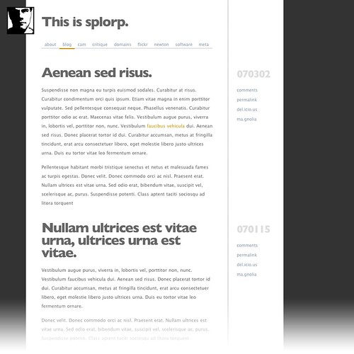
What you see above (and here) is the latest incarnation of the design. For comparison purposes, here’s an early iteration of last year’s model. My standard high contrast avatar is now the site’s ‘logo’. Consistent branding being a concept hammered into my brain on a daily basis. The logo may or may not harbour an easter egg at some point (you’ll just have to wait and see). A slightly tracked Gill Sans Bold now pops as the headline face (at least for Mac users) and Lucida Sans remains for body copy and typographic incidentals. What the Windows user will see has yet to be decided, but it will probably be a heavier weight of Arial or some such utility-grade sans serif.

The predominant use of whitespace in the previous design has been replaced by darker framing elements. A simple “sheet of white paper on a surface” look.

So what makes me think that I can actually launch this design before the next CSS Reboot? This one was built directly in code, not Photoshop. Barring any IE6/7 snafu-shas during tweaking, it’ll happen.

Comments? Please.

This item was posted by Grant Hutchinson.

Categories:

Leave a comment or send a trackback from your own site.

14 comments on “Sneak peek.”

  1. Posted by Grant Hutchinson Grant Hutchinson on Monday, March 12th, 2007.

    Frankly, I am too.

    Reply

  2. Posted by Michael Michael on Wednesday, March 14th, 2007.

    I have to say I like the current design better. It’s grown on me. The new one doesn’t seem to have any character. It just looks so… PostScript c. 1986. (Sorry!)

    Reply

  3. Posted by Dialog Dialog on Wednesday, March 14th, 2007.

    It looks like a Xerox. From the future.

    Reply

  4. Posted by Grant Hutchinson Grant Hutchinson on Thursday, March 15th, 2007.

    Considering PostScript technology was very much treated like a ‘Xerox from the future’ back in the early ‘desktop puddling’ days … I’d have to agree with both those comments. To be honest Michael, the current design has grown on me too … and perhaps that’s the problem with it. I have become so used to it, I don’t feel compelled to do anything with it — or the site. The great thing about this CSS-based design is that I can easily modify and tweak chunks of it — gradually or all at once. The current state of the site and it’s structure doesn’t allow me to do that. And web design is all about iteration, feedback and improvement.

    Reply

  5. Posted by Morgan Aldridge Morgan Aldridge on Tuesday, March 27th, 2007.

    Looks like it’ll be good, although this design has grown on me as well. I like to see more people working in grayscale and with high-contrast avatars!

    Reply

Leave a comment.

Use these HTML elements and attributes to format your comment:

<a href="" title=""> <abbr title=""> <acronym title=""> <b> <blockquote cite=""> <cite> <code> <del datetime=""> <em> <i> <q cite=""> <s> <strike> <strong>