August 1, 2003
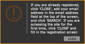
Click close.
 I just had to share this with someone. It doesn’t matter whether you are already registered on the Photonica site or not. Simply put, if you’re not signed in, you’re presented with this confusing lump of interface nonsense. Please tell me why registered users should have to navigate past this singular piece of idiocy? Ever heard of using cookies to store session variables or identifiers, people? Never mind the fact that it takes a good two or three reads of the text to understand what the hell they’re trying to say in the first place. I am so gone. Oh, and the kicker? The message is designed to look like a modal dialog box, but takes on the appearance of an error message. What did I do? What’s wrong with the site? When I click the button, does my browser window close? No, a new page loads into the same page. Oh, that makes sense. This is bad on so many levels, my head hurts.
This item was posted by .
Categories:
Leave a comment or send a trackback from your own site.