June 30, 2003
Here kitty, kitty.
I haven’t commented on the pre-release of Mac OS X 10.3 yet, primarily because I’d like to play with it in person before passing any cursory judgements. Since I wasn’t fortunate enough to attend WWDC this past week, I’ll have to be patient until Apple posts Panther on the Developer Connection site. In the meantime, I certainly can’t be expected to keep completely quiet regarding the hubbub. Case in point… I’ve noticed several subtle (and pleasing) differences in comparing the menus found in Jaguar to those in the pre-release of Panther.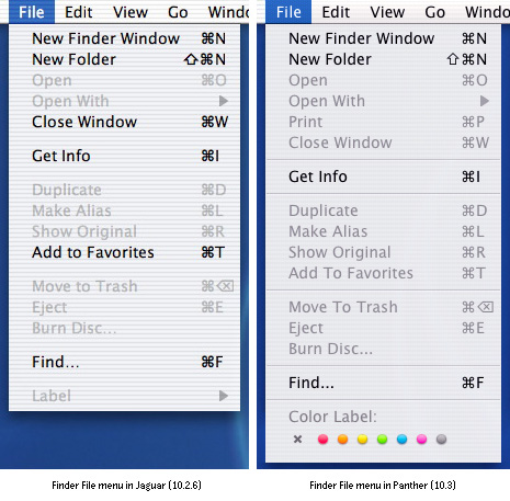 The first thing is the continuation of the ‘flattening’ the interface. This was something you could see starting to happen during the transition to Jaguar — subtler drop shadows, less bubbly buttons and so on. In Panther, you can clearly see how the striped background texture found in the both the menu bar and menus has been softened. The texture is much less obvious and doesn’t imply any false item dividers. And speaking of item dividers, praise Tog and pass the guidelines, they’ve returned to the menus. Using only visual spacing between item groups in pre-Panther menus didn’t offer quite enough differentiation between groupings, particularly when combined with the continuous horizontal noise introduced by the striped texture. We had obvious dividers between menu item groups since the very first incarnation of the Macintosh. Believe it or not, they were there for a reason. Less noticeable than the textural changes are the slight modifications that have been applied to the various special characters used in the menu item text. Notice how much tidier (I suppose you could say less blobby…) the shift and command glyphs appear in the Panther menu. It could be my imagination, but I’m sure that the overall appearance of the regular characters in the menu and menu bar has been fine-tuned as well. The characters seem to have lost some fuzziness around the edges. This could have something to do with the font smoothing style I have selected in my System Preferences as compared to the settings of the Panther system which generated the screen shot, but confirmation of this will have to wait until I have Panther installed. Last of all, I’m genuinely tickled to see that the file label option has finally returned as a native function of the Finder. I still think the piddly $10 I spent on Unsanity’s Labels X has been worth it. The sheer amount of files I work with makes it imperative that I be able to organize by colour and category. Labelling was one of the small necessities that I missed from the moment I started using OS X. I take solace in the fact that I’ll get at least few more months of use out of Labels X, since Panther won’t be hitting the mainstream until fall. Oh, and did you notice that the Print menu item has come back to roost as well? Whether this is to print files or window contents or both remains to be confirmed. Now, let’s see what else I can dig up.
This item was posted by .
Categories:
Leave a comment or send a trackback from your own site.